top of page
CLIENT:
HIDEMI / POP-UP STORE SHANGHAI
CATEGORY:
ART DIRECTION / SET DESIGN / PROP STYLING

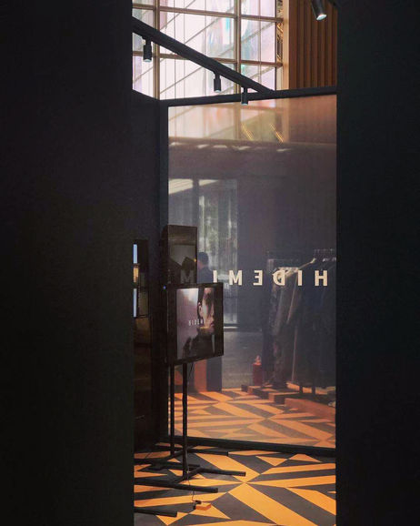
The beautiful rhomboidal pattern was designed by Hidemi and took a huge part from their Autumn collection. Aiming to give away a strong impression of the hidemi brand and giving more connection to the product itself we decided to using the pattern as our main rhythm for the project.
The store is located at Shanghai Xintiandi, a landmark commercial complex. Its multi-level height atrium lobby allows guests to overlook the store from the higher floor. Upon visiting this site, we saw this condition as an advantage, a very good opportunity to make bigger impact.
Based on the above reason, we stretched the brand logo, making it part of the store structure to create a strong visual impact.
The beautiful iconic brand pattern is the main element for the design, whose sharp colour contrast serves as a magnet for passersby. The huge stretched logo entrance is also eye-catching. The space between letters not only creates dynamic dimensional flow also creates a charming lighting effect. Moreover, we used translucent gradient fabric screen to replace solid walls, blurring the boundary between the inside and outside, adding a hazy aesthetic and also keeping privacy from inside.
bottom of page


